Client For:
Trading Central
Overview
Trading Central is a global leader in investment analytics, providing actionable insights to millions of investors worldwide. The challenge was to modernize its Featured Ideas platform — transforming dense technical data into a clean, intuitive experience that both novice and seasoned traders could trust.
As Lead Product Designer, I guided the end-to-end UX process: from uncovering user pain points and redefining information hierarchy to designing a scalable interface adaptable across brokerage partners. The result was a streamlined decision-support tool that combined clarity, confidence, and data integrity — driving measurable gains in engagement and user satisfaction.
Goal:
Empower investors to quickly understand and act on trading opportunities through a transparent, human-centered experience.
The Challenges
User Goals
- Simplify the Trading Workflow — Make complex dashboards feel intuitive and action-oriented.
- Enhance Trust and Clarity — Reveal why recommendations appear, not just what they are.
- Support Learning Journeys — Guide less experienced users through contextual help and tooltips.
- Enable Fast, Confident Decisions — Ensure advanced users can act quickly under market pressure.
Business Goals
- Increase engagement and feature adoption across key investor segments.
- Strengthen white-label product differentiation through superior UX.
- Reduce support requests tied to usability or interpretation issues.
- Improve conversion of trial users to paid subscriptions through better onboarding clarity.
Discovery
My first step was to understand how traders and investors process information under time pressure. I conducted a design audit across Trading Central’s existing dashboards, reviewed user personas, and analyzed feedback from board-level user groups and advisory panels. This revealed recurring themes around information overload, lack of transparency in signal generation, and inconsistent experiences across platforms.
Insights
- Traders often felt overwhelmed by visual noise and multiple alerts.
- Both professionals and retail users wanted to see the reasoning behind each trading signal.
- Users needed a faster path to insight, without sacrificing trust or accuracy.
- Cross-platform consistency was essential for credibility.
- Accessibility (color contrast, labeling) was critical for compliance and inclusivity.
Personas & Mental Models
- All personas want to understand the “why” behind trade signals.
- Users differ in tolerance for data density—experts crave control; learners crave simplicity.
- Cross-device access must be seamless—most use home + work setups.
- Even advanced users value learning aids and confidence reinforcement.
- Dashboards and alerts should match personal rhythm, not one-size-fits-all defaults.
Definition
After analyzing user interviews, trading audits, and persona behaviors, it became clear that Trading Central’s core challenge wasn’t about data availability—it was about data usability. Users of all skill levels could access rich analytics, but many struggled to translate complex signals into confident decisions.
Problem Statement
How might we help traders of varying experience levels interpret, trust, and act on market insights quickly—without sacrificing depth or control?
User Goals
- Simplify the trading workflow—intuitive and action-oriented.
- Enhance trust and clarity—explain why, not just what.
- Support learning journeys—contextual help and tooltips.
- Enable fast, confident decisions—optimize for time-pressure.
- Ensure accessibility and consistency across devices.
Business Goals
- Increase engagement and feature adoption across segments.
- Strengthen white-label differentiation via UX.
- Reduce support requests tied to interpretation issues.
- Improve trial-to-paid conversion through clearer onboarding.
Design
Mental Models
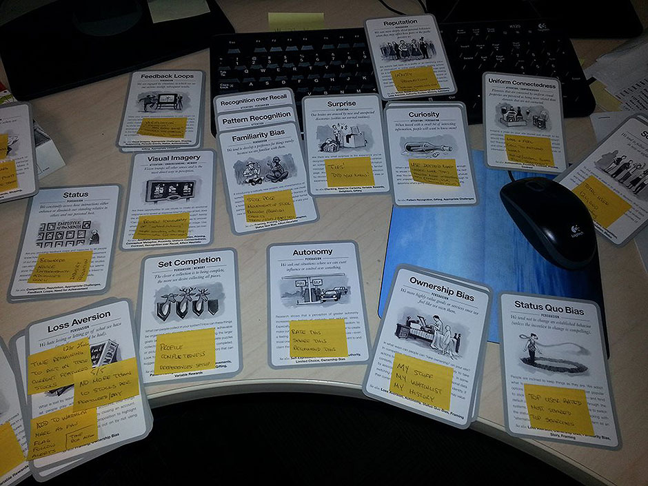
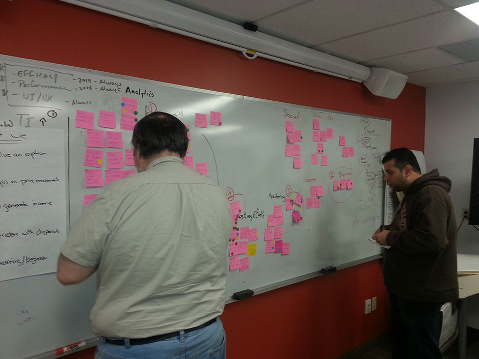
To align product design with how traders think and decide, I ran a mental-model mapping exercise. Using behavioral design cards and sticky notes, the team identified patterns such as Loss Aversion, Status Quo Bias, and Pattern Recognition. These insights explained hesitation to act on signals—many wanted validation before moving, reflecting a need for confirmation.
Key Insight
Traders’ decisions are shaped as much by emotion and habit as by data. The interface needed to reinforce confidence through clear explanations, feedback loops, and predictable interactions.
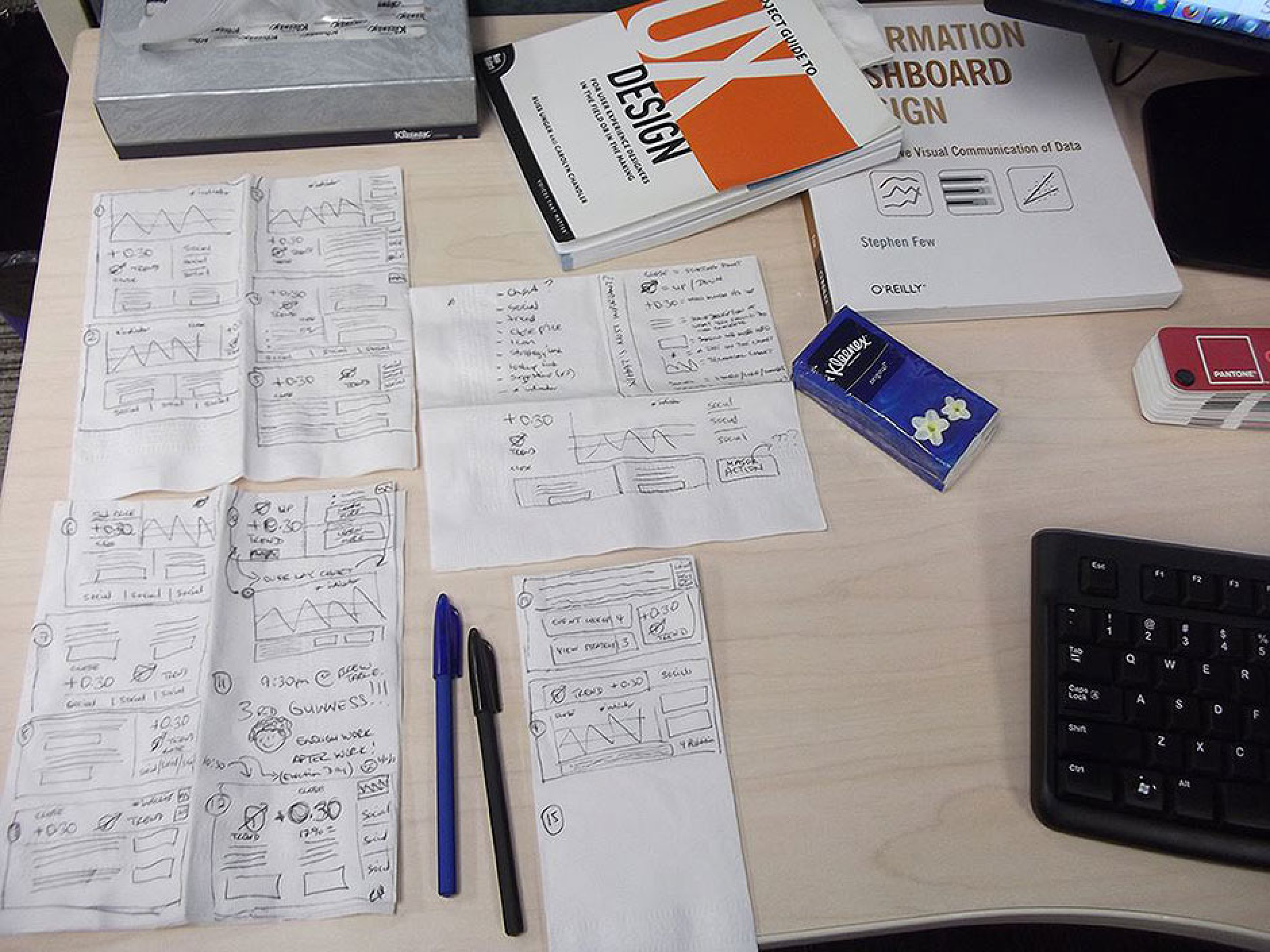
Sketching
Early concepts were hand-drawn to explore layout hierarchies, visual rhythm, and data groupings—referencing Stephen Few’s Information Dashboard Design and O’Reilly’s Visual Communication of Data as grounding principles.
Outcome
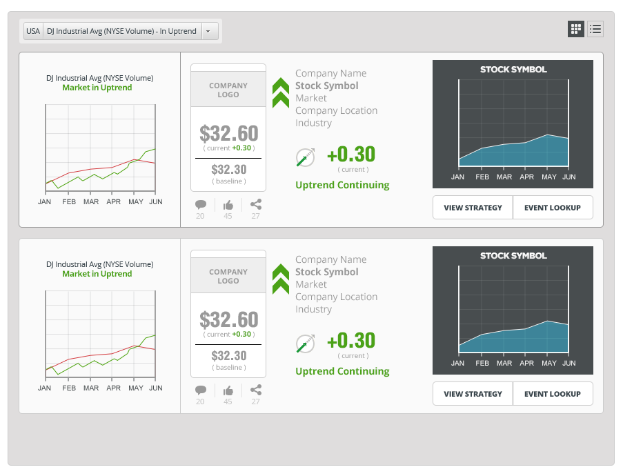
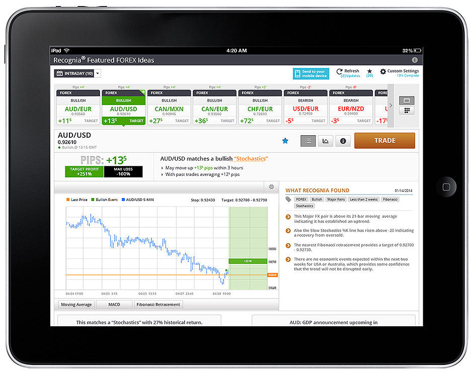
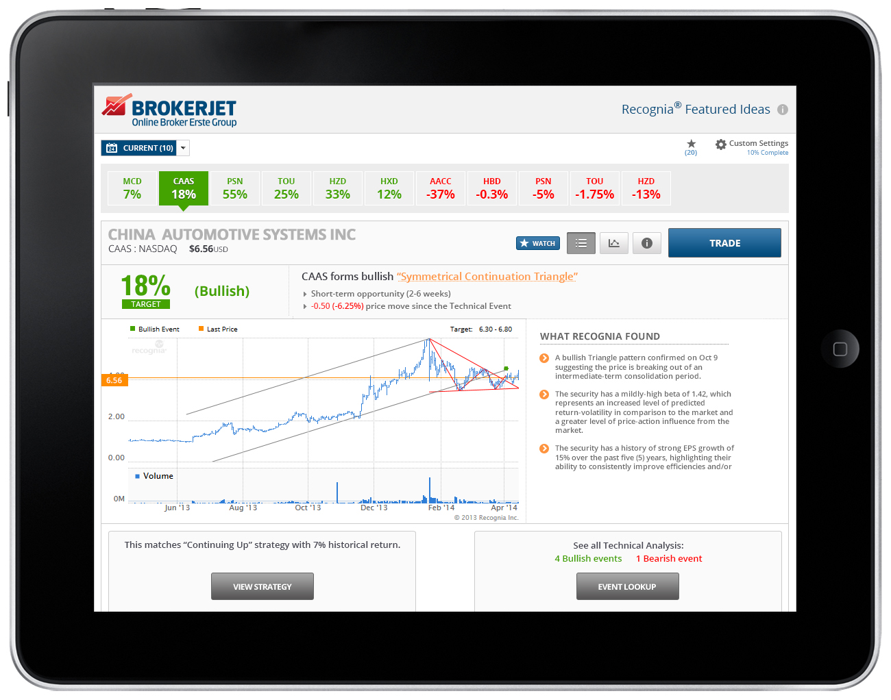
- Signal Timeline — consolidated alerts, sentiment, and analytics into a single-glance view.
- Simplified action areas (Buy / Sell / Watch) replaced deep menus.
- Decision-first summaries — actionable first, supporting detail second.
What are others doing?
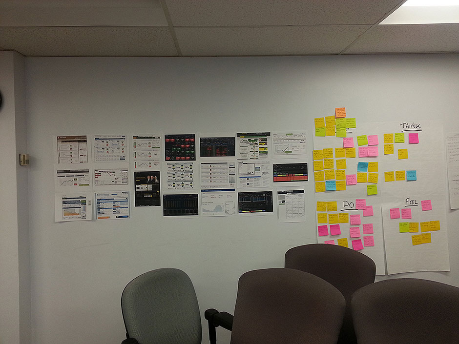
I analyzed dashboards from leading financial platforms (Bloomberg, CNBC, Fidelity, etc.) to map strengths and usability gaps. Many excelled at data density but lacked contextual clarity for less experienced users.
Outcome: A visual direction emphasizing simplicity and contrast—minimal noise, maximum interpretability.
Feature Mapping Workshop
We prioritized requirements around three pillars: Usability (navigation, hierarchy, simplicity), Analytics Depth (surface what matters), and Engagement (keep users in flow). This revealed redundancy and clarified where new indicators could better communicate risk and opportunity.
Outcome: A clear hierarchy of must-have vs. nice-to-have features guiding MVP and roadmap.
Testing
With initial concepts and wireframes complete, we validated performance against user expectations using moderated usability tests, A/B experiments, and stakeholder reviews.
Wireframes
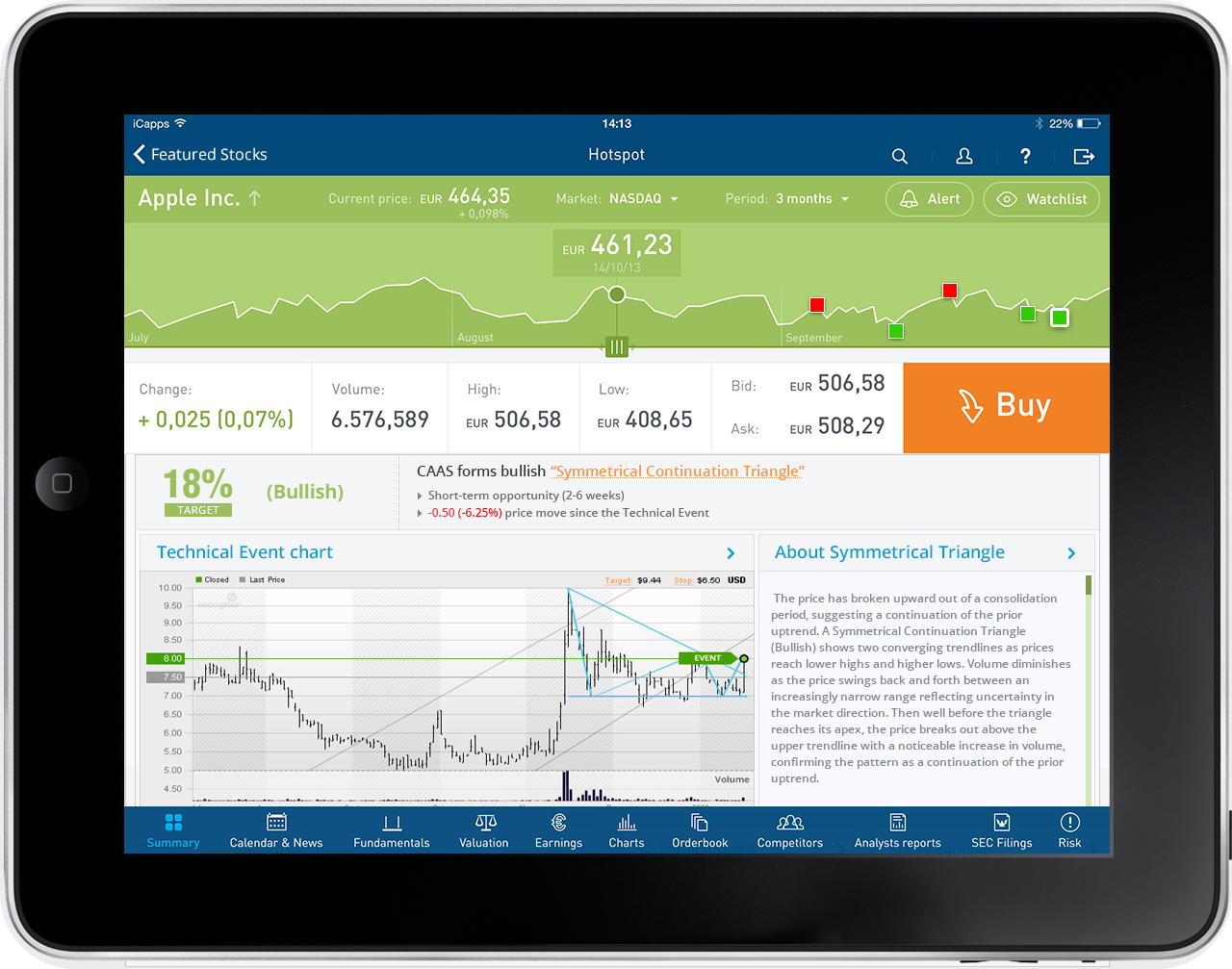
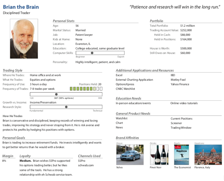
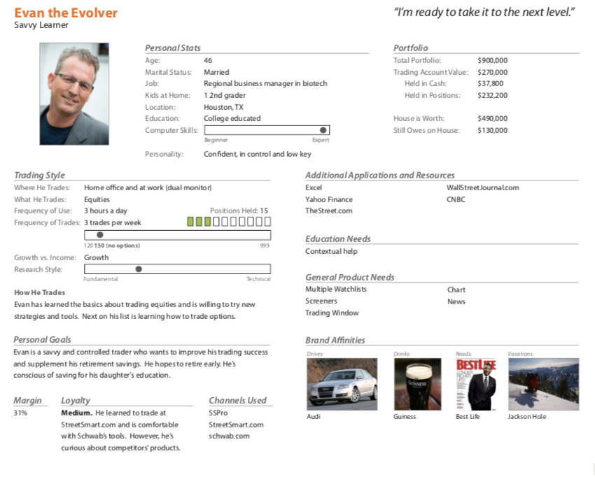
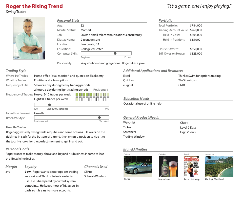
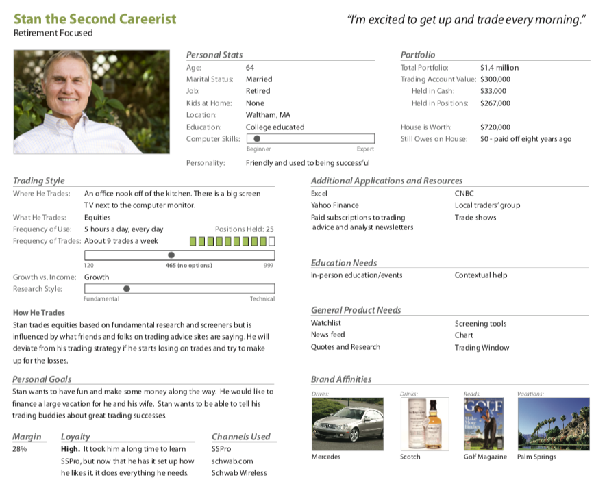
Sessions with traders from each persona (Brian, Evan, Roger, Stan) focused on navigation logic, content hierarchy, and comprehension speed.
- Users overlooked performance summaries → Increased font weight; added contrasting background.
- Confusion over button hierarchy → Introduced clear Primary / Secondary color rules.
- Overly dense tooltips slowed interaction → Replaced with hover-triggered micro-explanations.
Concept Designs
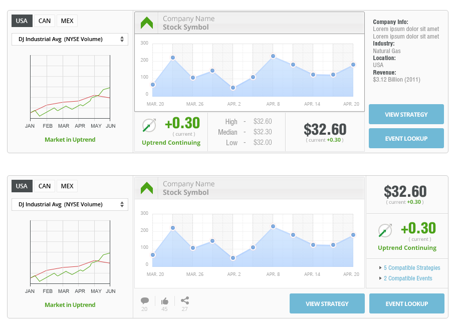
Mid-fidelity prototypes compared dark vs. light modes, flat vs. 3D graphs, and signal density per panel.
- Experienced users preferred dense views with hover-to-expand details.
- New traders gravitated to the clean “Quick Summary” with sentiment indicators.
- Color perception testing confirmed red/green signals needed alternative cues for accessibility.
Result: A neutral-themed interface emphasizing calm clarity and trustworthiness.
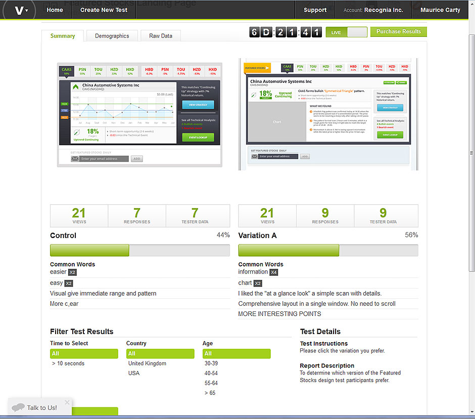
A/B Testing
- Variant A (Compact summaries) → Higher quick-decision interaction rate (44%).
- Variant B (Deeper panels) → +14% longer sessions; preferred by analysts (56%).
These results informed an adaptive dashboard strategy—tuning layout complexity by user profile.
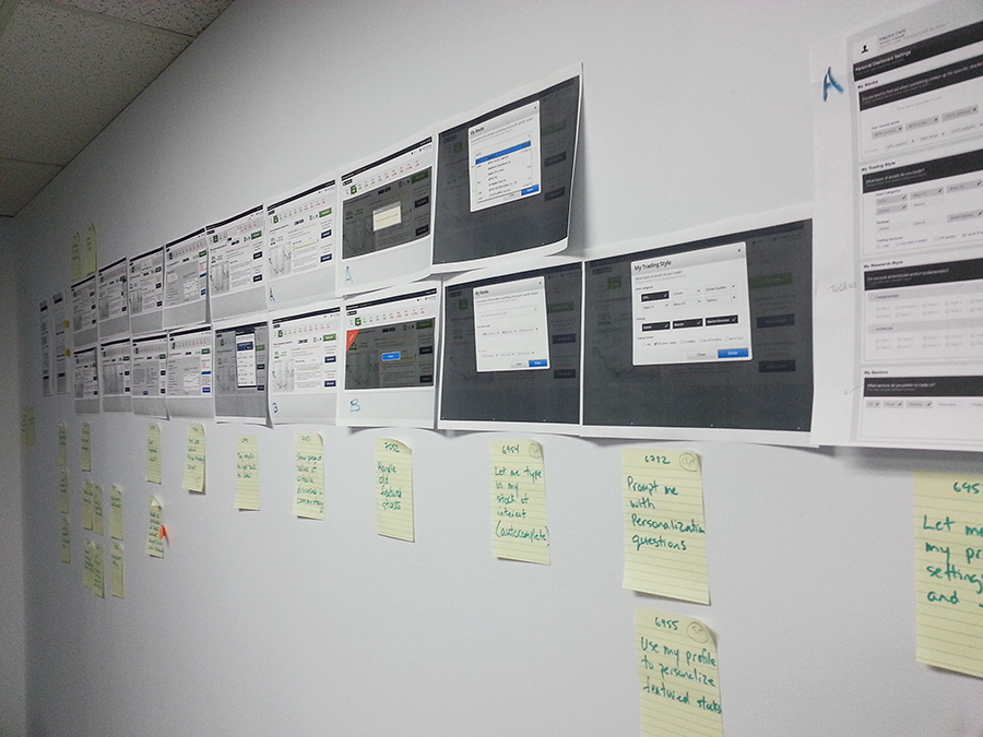
Visual Boards
We created a feedback wall so design, product, and engineering could trace decisions. Stakeholders could see how insights shaped evolution—accelerating approvals.
Metrics
- Navigation success rate: 68% → 91% (+23%)
- Average task time: 1.8 min → 1.2 min (–33%)
- User confidence (1–5): 3.0 → 4.4 (+1.4)
Summary: Users interpreted and acted on signals about 30% faster with higher confidence and fewer errors—aligning with user and business goals.
Iterations
- Visual Boards curated inspiration, tracked design updates, and aligned teams on vision.
Conclusion
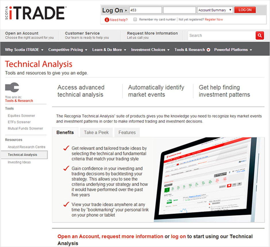
The B2B2C application was white-labeled for multiple trading platforms and financial institutions (e.g., Scotia iTRADE, Questrade, BNP Paribas, BrokerJet, Charles Schwab, Bloomberg). It achieved its objectives with increased user engagement, improved trade conversion, and positive client feedback.
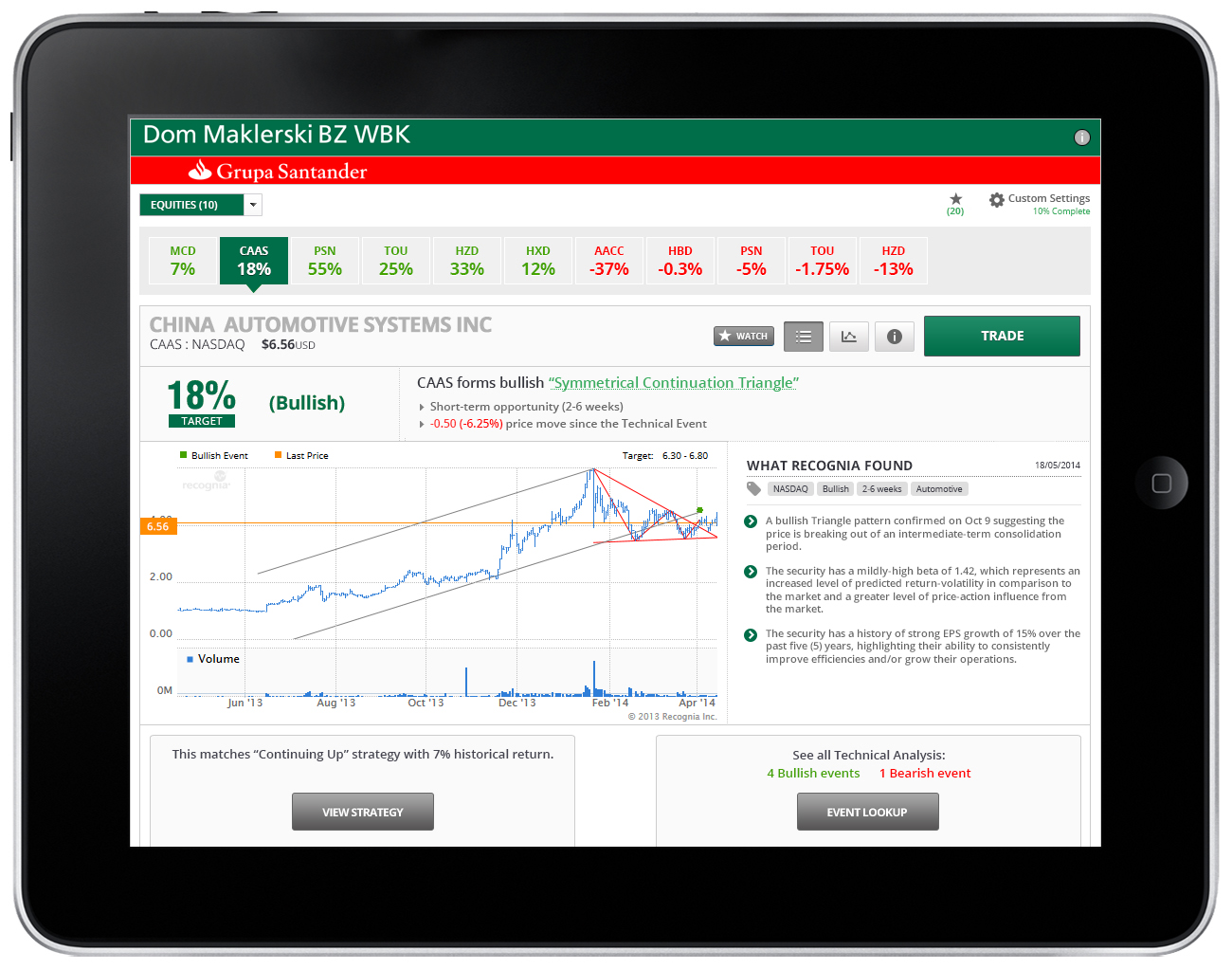
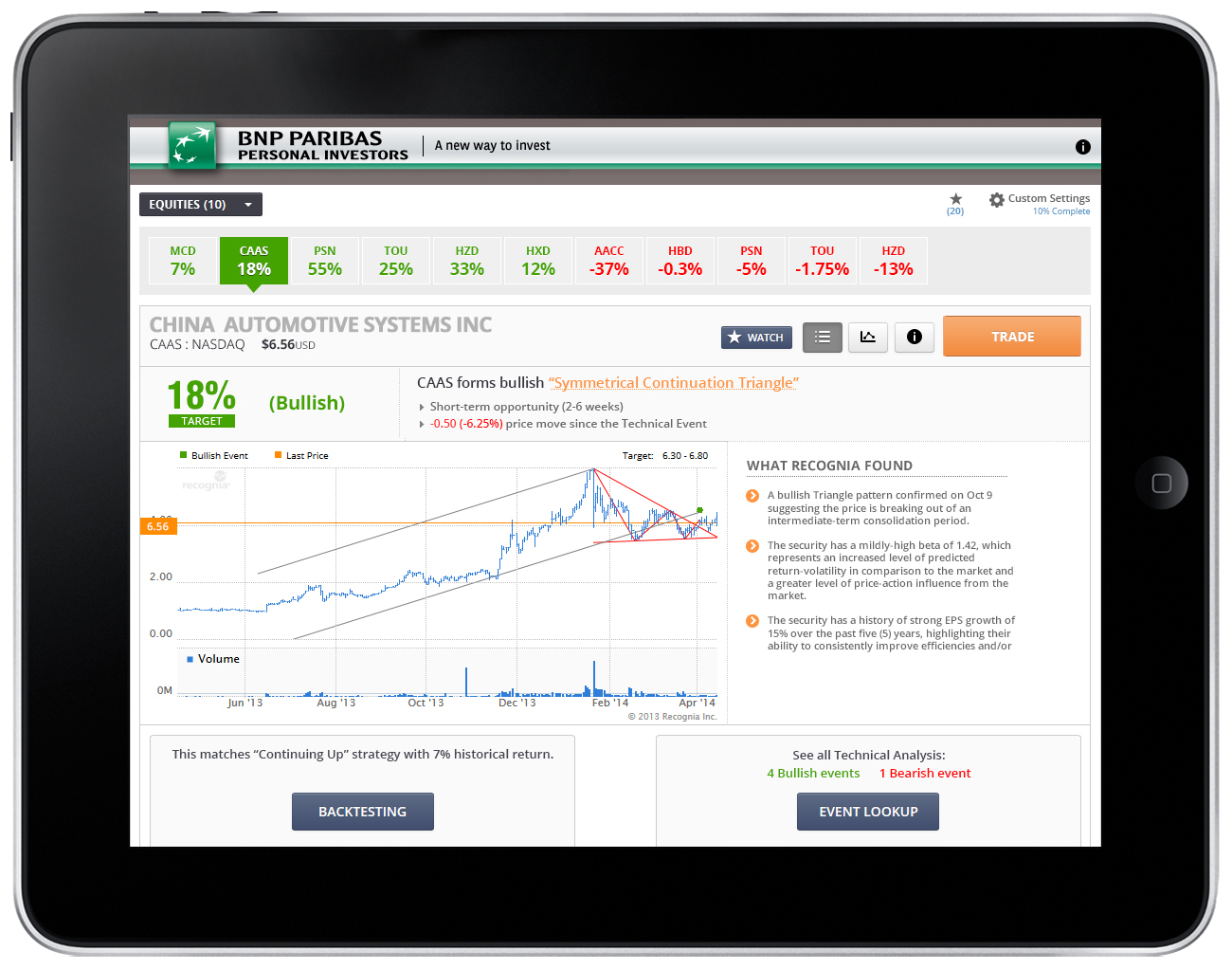
The combination of user-centric design, modern visuals, and a seamless experience resulted in a more competitive product. Ongoing monitoring and iterative improvements continued using the initial solution template.