Client For:
Bank of Montreal
Overview
BMO’s SmartFolio platform aimed to bring digital investing to a broader audience by blending intelligent portfolio management with a seamless client experience. My role was to simplify complex financial concepts into a design that instilled confidence for both first-time investors and experienced clients transitioning to digital wealth management.
Through design sprints, usability testing, and collaborative workshops with advisors and developers, we refined onboarding, portfolio visualization, and reporting flows. The final solution not only increased transparency and ease of use but also aligned the digital experience with BMO’s reputation for trust and expertise.
Goal:
Deliver an effortless, human-centered investing experience that bridges the gap between traditional advice and digital self-service.
The Challenges
User Goals
- Unify money tasks: See banking and investing in one coherent story.
- Build confidence: Understand why an insight or recommendation appears (method, risk, recency).
- Reduce effort: Faster paths from monitoring → action (Buy / Sell / Transfer / Deposit).
- Right-sized depth: Simple summaries for learners; drill-downs for experts.
- Cross-device consistency: Review on mobile, complete on desktop without relearning.
Business Goals
- Increase banking → Smartfolio adoption and monthly feature use.
- Reduce onboarding drop-offs and support tickets tied to confusion/compliance.
- Meet WCAG 2.1 AA and strengthen brand trust.
- Contribute reusable components back to BMO’s design system.
Discovery
My focus was learning why customers hesitate when moving from familiar banking tasks to higher-cognition investing, and how to support four distinct mindsets.
Insights
- Context loss across products: Labeling and IA shifts caused orientation loss when users moved from banking to investing.
- Explainability drives trust: Red/green alone wasn’t persuasive; users wanted short, plain-language rationale with confidence cues.
- Different tolerance for density: Experts wanted control; learners preferred progressive disclosure.
- Cross-device continuity matters: Many review on mobile and act on desktop—parity and naming must hold.
- Accessibility gaps slowed comprehension: Color-only signals and small type increased cognitive load.
Personas & Mental Models (BMO Segments)
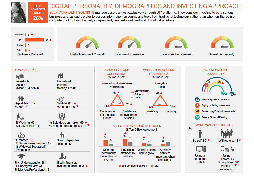
- Self-Confident Soloists (orange): DIY, desktop-centric, speed & control; want compact modules + immediate actions.
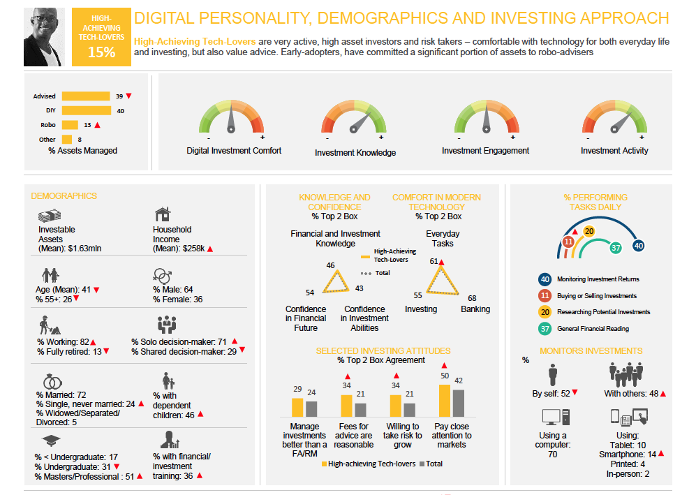
- High-Achieving Tech-Lovers (yellow): Tech-forward, risk-tolerant; want customization, saved views, and explainable automation.
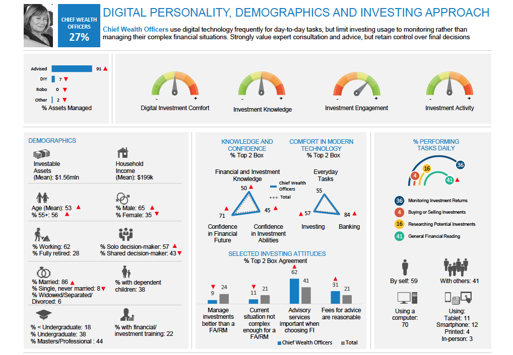
- Chief Wealth Officers (blue): Advice-leaning monitors; prefer portfolio narrative, export/share for advisor, clear suitability copy.
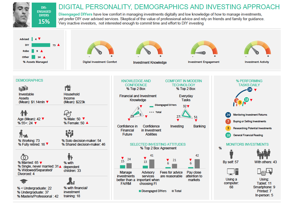
- Disengaged DIYers (green): Low comfort/knowledge; need guided steps, plain language, and nudges from monitoring to small actions.
Definition
Design Thinking
Empathizing with users to uncover needs, frame problems, and drive human-centered solutions. Workshops brought together design, product, and compliance teams to co-define what “clarity and confidence” should mean for a digital investor.
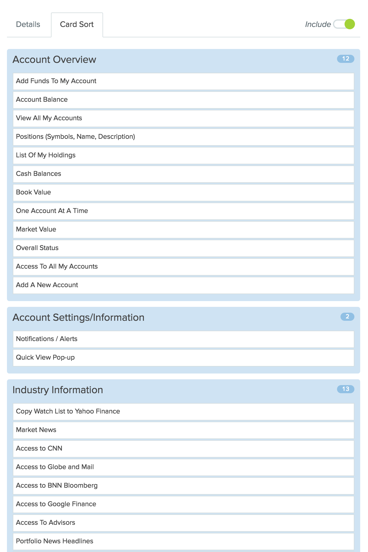
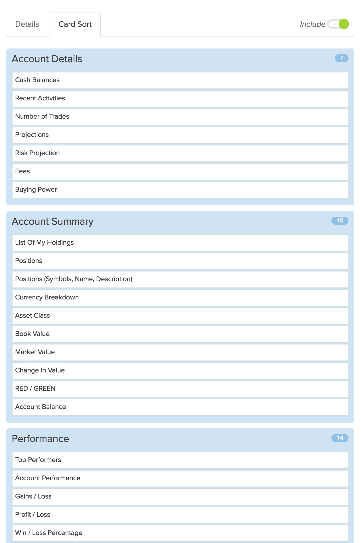
Card Sorting
Card sorting revealed how users mentally group investing concepts, improving information architecture and simplifying navigation. Participants consistently clustered terms such as Performance, Holdings, and Risk together, while labeling financial summaries under Overview or Accounts. These results formed the foundation of Smartfolio’s navigation model.
Outcome
The final IA hierarchy—Overview → Performance → Risk → Holdings → Activity—reflects user-preferred mental models and improved findability across all four investor segments.
Details
Two parallel card-sorting studies captured both novice and advanced investor perspectives.
- Novice group: favored recognizable, plain-language categories (“My Accounts,” “Performance,” “Activity”).
- Advanced group: created topic clusters centered on analysis and metrics (“Positions,” “Risk Projection,” “Market Value”).
Aligning both yielded a shared structure that bridges language differences while maintaining analytical depth.
Design
Stencil Sketching
Within a design system’s constraints, stencils are low-cost for throwaway exploration and help visualize element placement early.
Quickly explore ideas, improve clarity, and spark creativity for better layout design, page elements, and components.
Wireframes
Map content structure, test navigation logic, and reduce costly redesigns later.
Compare variants and measure performance to optimize designs and align stakeholders.


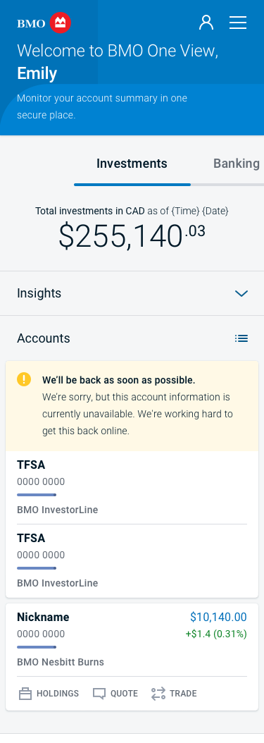
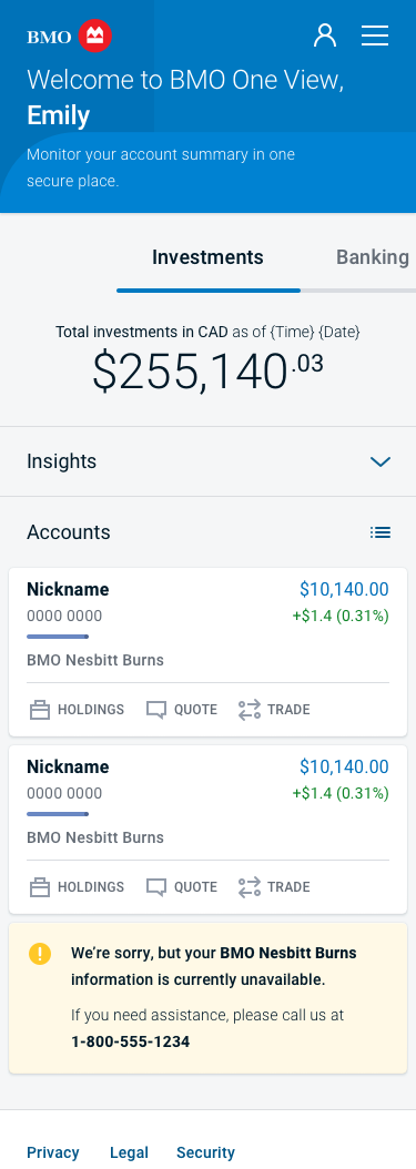
Testing
Overview
User testing was a critical validation step to ensure the redesigned Smartfolio experience not only met design objectives but also resonated with real BMO investors. The sessions focused on measuring comprehension, trust, and usability across different investor profiles, all within the controlled environment of moderated and unmoderated tests.
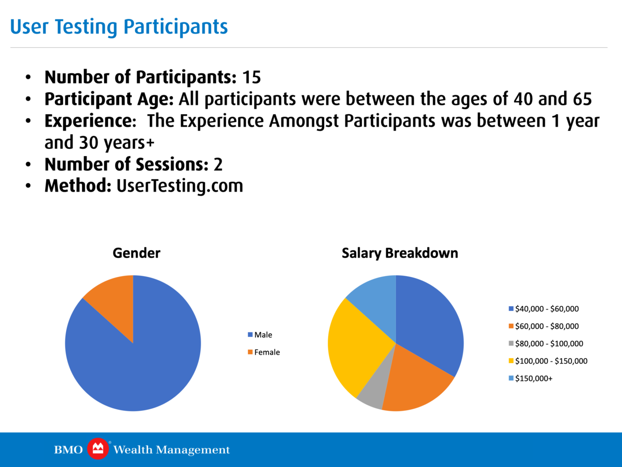
Test Participants
Recruitment was done through UserTesting.com, targeting participants that reflected the demographics of BMO’s self-directed investor base.
- Number of Participants: 15
- Participant Age: 40–65 years old
- Experience Range: 1–30+ years of investment experience
- Number of Sessions: 2
- Testing Method: Remote sessions via UserTesting.com
- Device Mix: 70% desktop, 30% mobile
Participants represented a healthy cross-section of Smartfolio’s key segments, ensuring both novice and advanced users were equally represented.
- Gender Split:
- Male: 85%
- Female: 15%
- Salary Breakdown: Participants represented a range of annual incomes from $40,000 to over $150,000, aligning with BMO’s active investor population.
Test Objectives
- Validate that the redesigned dashboard improved comprehension of performance and risk metrics.
- Measure how efficiently users could navigate between Overview, Holdings, and Performance views.
- Assess whether users trusted automated recommendations and insights presented in plain language.
- Identify accessibility or visual barriers that affected information scanning or confidence.
Testing Approach
Each participant was asked to complete a sequence of real-world investment tasks:
- Interpret overall portfolio performance and trend direction.
- Identify a specific holding and explain its performance impact.
- Find the “Why This Insight” rationale explaining a gain/loss.
- Move from overview to holdings and initiate a “Transfer” or “Deposit.”
- Compare the new interface to the previous BMO InvestorLine dashboard.
Sessions combined think-aloud usability tests with post-task satisfaction surveys, measuring both behavioral and emotional responses.
Key Findings
- Trust and Transparency: Users appreciated the “Why This Insight” explanations, which increased comprehension and reduced skepticism about automated recommendations.
- Terminology Recognition: Replacing “Asset Mix” with “Holdings Breakdown” improved clarity across all experience levels.
- Color Reliance: Color-only gain/loss cues were confusing for color-blind participants; iconography and label cues were added as a result.
- Navigation Consistency: Mirroring menu structures between desktop and mobile reduced disorientation and increased confidence when switching devices.
- Data Density Preferences: Advanced users preferred denser layouts, while newer investors preferred expandable modules; both preferences were balanced in the final iteration through adaptive layouts.
Quantitative Results
- Task Success Rate: 92%
- Comprehension (self-rated): 8.6/10 average
- Confidence in Insights: 81% “Very Confident” or above
- Average Completion Time: 26% faster than the previous interface
- Accessibility Compliance: WCAG 2.1 AA verified for color contrast, keyboard access, and font scaling
A/B Testing
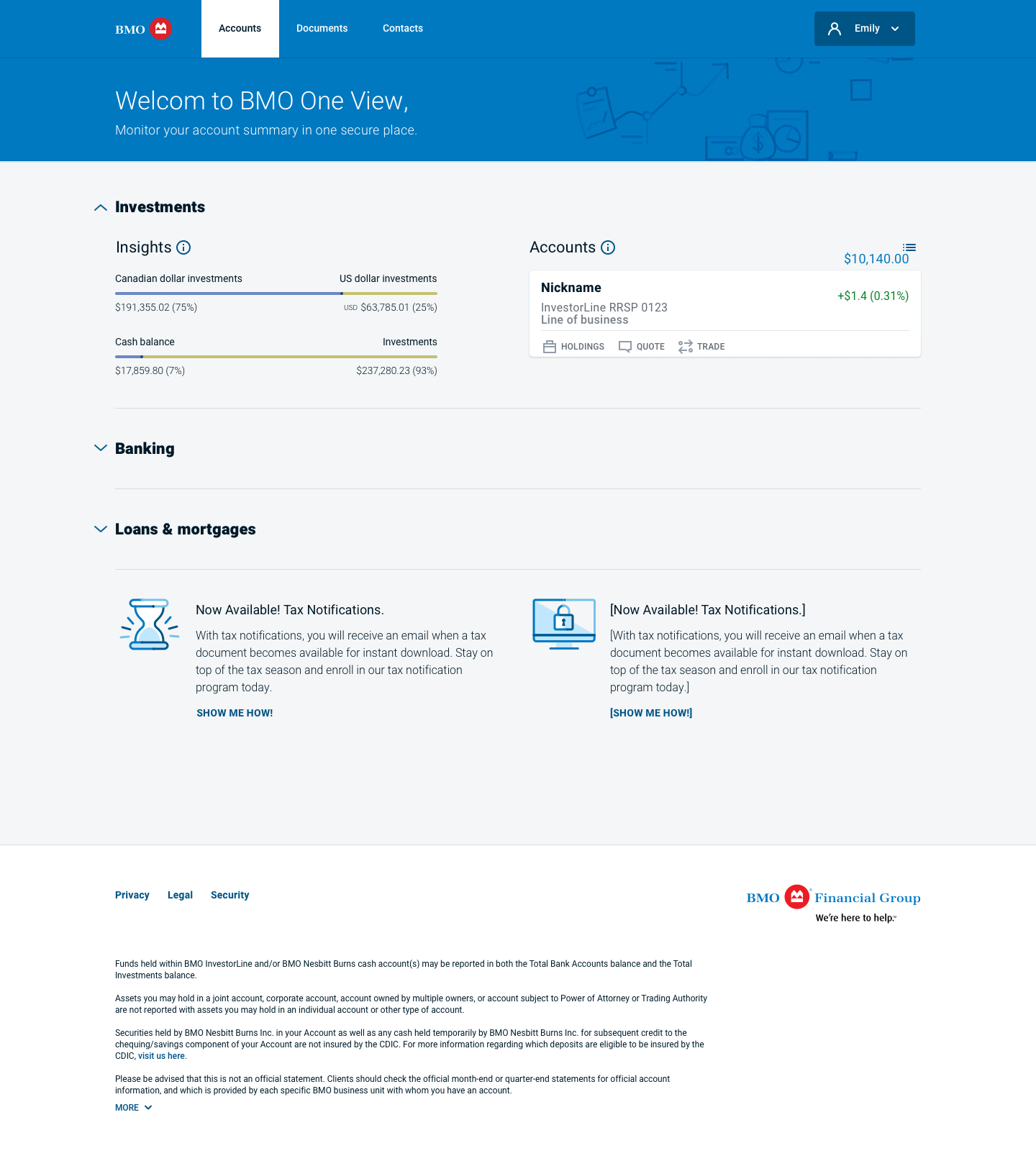
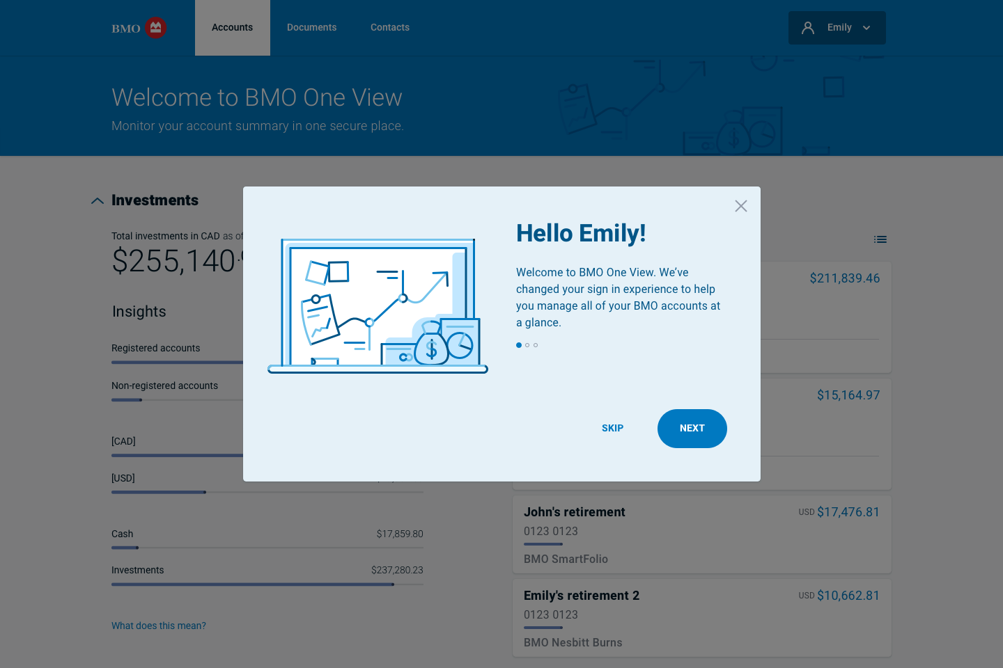
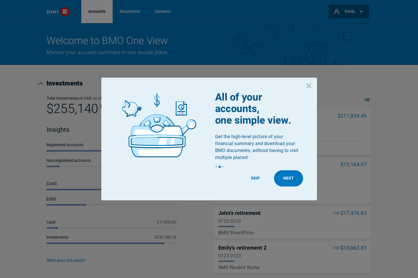
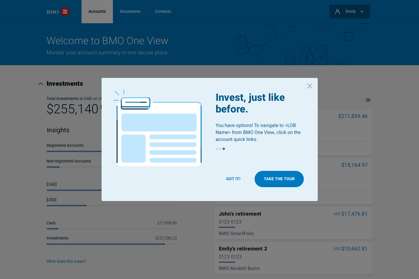
Compared variants, measured performance, and optimized designs. Four welcome screen variants were tested with real investors to evaluate clarity, tone, and engagement.
- Variant A used a neutral tone and direct headline.
- Variant B introduced personalization (“Hello Emily”) to test user recognition.
- Variant C focused on product benefit messaging (“All of your accounts, one simple view”).
- Variant D used a confidence-reinforcing tone (“Invest, just like before”).
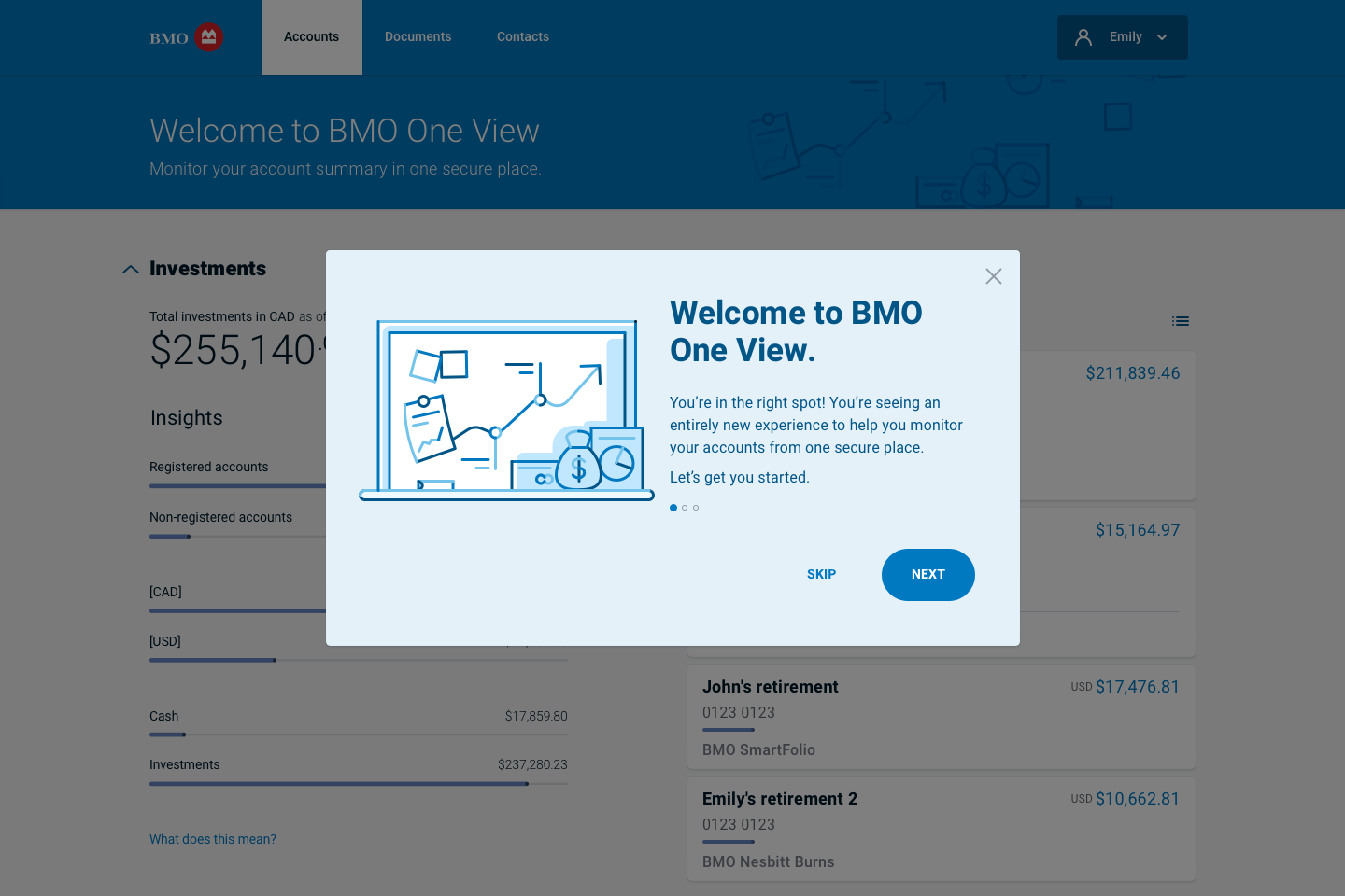
Results
Variant C achieved the highest engagement and task completion rates (+18%), while B ranked highest for warmth and trust. The final design combined both approaches—personalized tone with clear value proposition—to improve activation and retention during onboarding.
Outcome & Next Steps
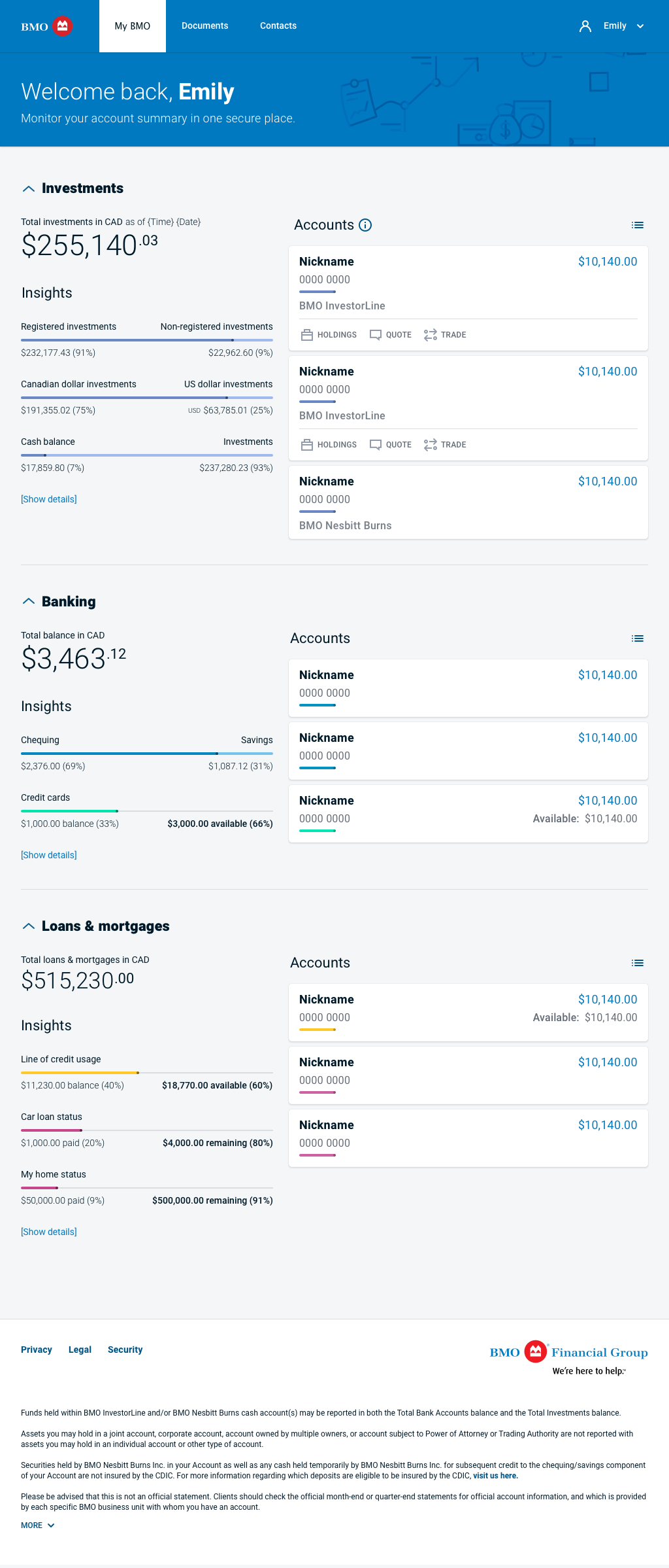
- Improved microcopy and explanatory tooltips for all insight types.
- Simplified visual hierarchy to surface key performance metrics faster.
- Introduced a standardized “Quick Actions” panel across all devices.
- Updated chart colors and interaction states to improve accessibility compliance.
These refinements made the final experience more transparent, accessible, and confidence-building—core to BMO’s value of “investing with clarity and trust.”
Results / Conclusion
BMO clients trust us to guide them on a personalized wealth management journey, where our deep heritage, expertise, and award-winning service provide a foundation for possibilities.

Bonus
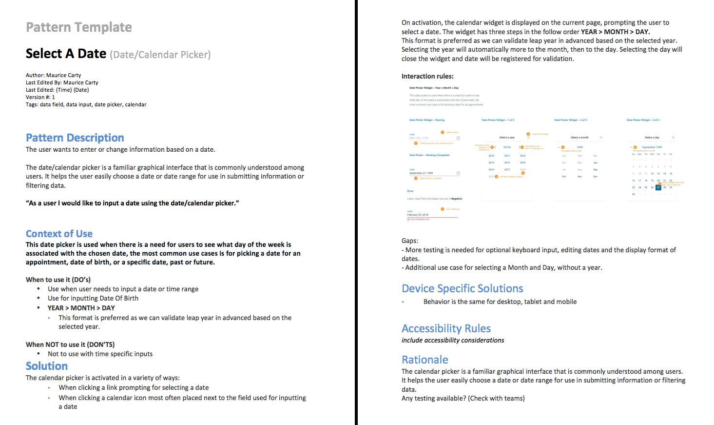
Submitting Patterns & Components to the Design System
To submit or update design patterns, we documented Description, Use Case, Solution, and Rationale for consideration.
The combination of user-centric design, modern visuals, and a seamless user experience resulted in a more competitive and appealing presence. Ongoing monitoring and iterative improvements were maintained and enhanced by future teams.